Laura Martin
Posted: March 12, 2009
_
 Laura Martin is the colorist on The Stand and she was kind to take a break in her schedule to talk to me. Here is what she said.
Lilja: So tell me a little about yourself. Who are you and what have you done so far in comics?
Laura Martin: I’ve been a professional comics colorist since I graduated from the University of Central Florida in 1995. My major was in graphic design, but I rediscovered comics while I was a student. The minute I realized that people get paid to make comics, I changed my senior projects to comics-related art. It worked; in the September following graduation, I joined Wildstorm Productions as a brand-new colorist.
After spending a few years at Wildstorm in San Diego and CrossGen Comics in Tampa, I went freelance, and have been a freelance colorist for the last five years. Most of my work comes through Marvel Comics, but I also have worked with DC Comics, Dark Horse, Virgin Comics, Humanoids (a French publisher), and other studios. I’ve enjoyed working with some of the biggest names in comics – both creators and characters – and have won numerous awards throughout the years.
My most recent projects have included Astonishing X-Men, with Joss Whedon and John Cassaday; The Ultimates volume 2, with Mark Millar, Bryan Hitch, and Paul Neary;Thor, with J. Michael Straczynski, Olivier Coipel and Mark Morales; Secret Invasion, a major Marvel crossover event featuring almost all of the Marvel characters, with Brian Michael Bendis, Leinil Yu, and Mark Morales; Black Lightning, with Jen Van Meter and Cully Hamner; and, of course, Stephen King’s The Stand, with Roberto Aguirre-Sacasa and Mike Perkins. IDW Publishing recently announced that they will be republishing all of the classic Rocketeer series, drawn by Dave Stevens; I will be recoloring that series in its entirety. I’m also slated to color Adam Hughes’ All-Star Wonder Woman this year.
Lilja: How did you get involved in The Stand?
Laura Martin: It was an interesting process. Marvel wanted to try out several art teams, to see which one would be the best fit, so they asked if I would be interested in pairing with Mike Perkins for one of the samples. I immediately agreed, since The Stand is my all-time favorite Stephen King novel, and I like working with Mike. Mike drew some sample pages from a pivotal scene, and I referred heavily to the original novel to determine a color scheme. I colored the pages, and sent in the finished samples. Mike and I sat on pins and needles waiting for the results; finally, we received the word that we won the project. We started as soon as we could, and have been working on it ever since.
Lilja: How does it work practically? Do you get the sketches from Mike Perkins and then color them? Do you decide how and what colors should be used or is that a decision Mike makes?
Laura Martin: Mike pencils and inks each page on 11” x 17” Bristol paper. Once he finishes a page, he scans it in at a high resolution, and sends the scan to our editors at Marvel via a file transfer program. The editors check out the artwork to make sure everything’s okay, then gives the file to the production department, who resizes the digital file to print specifications. Then, the editors send me the file via the same file transfer system.
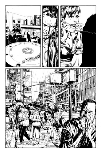
When I receive the digital “line art,” I’ll clean up the artwork a bit (making the blacks nice and black, erasing any stray marks in the margins). The next step is to “flat” the page. This means that either my assistant or I fill the basic shapes with flat colors, so that each shape is distinct from an adjacent shape. For instance, in the example below, Larry’s skin, hair, shirt, jacket, and phone are all flatted in different colors. At this stage, the choice of colors isn’t critical; that comes next.
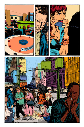
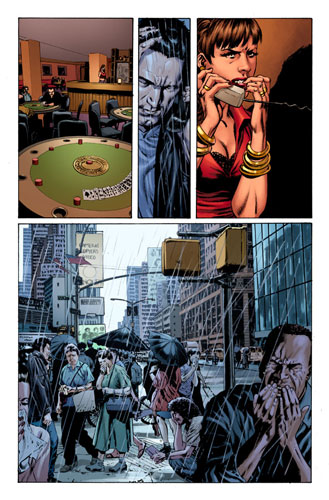
Once this phase is finished, I’ll determine a color scheme by reading over the script and the pertinent sections of the novel, to get an overall feel for the scene. Here’s a page from issue 4 as an example. On this page, the scene takes place in two locations: in a poker bar in California, and on a stormy day in Manhattan. I want these two locations to look noticeably different so the reader knows that the panels switch back and forth between the two locations. I chose a heavy brown-red-green color scheme for the bar for several reasons – it’s a bar, for one thing, with lots of wood and felt poker tables. Also, the waitress is scared, and red connotes heightened emotion. So the redness works on two levels. For Larry’s location, the scene is tinted heavily with blue to create a depressing, foggy misery, and to suggest a sense of sickness, since everyone on the streets has come down with Captain Trips.
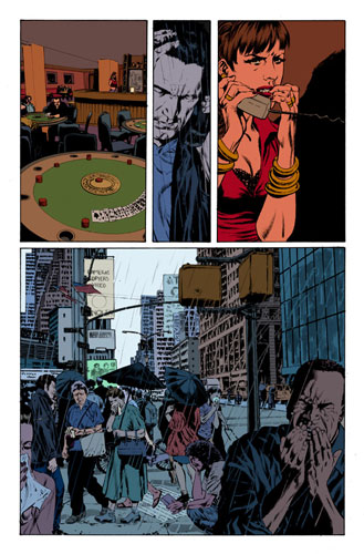
Once I choose a color scheme, I’ll begin digitally painting in highlights and shadows to give each shape dimension and form. I’ll use Mike’s inked shadows as a guide for placing my highlights, and I’ll attract the reader’s eye to important elements, such as the waitress in panel 1, by heightening the contrast on or around the important elements. Special effects that overlap the inked artwork are done at the end; in this case, fog and rain are added to panels 2 and 4 to create a sense of atmosphere and depth.
Once the page is finished, I’ll send in a low-resolution “proof” jpeg to the editors, Mike, and Roberto, and await any possible corrections.
Lilja: How often, if ever, do you have to ask Mike to make changes? And if you do, what changes are we talking about?
Laura Martin: It almost never happens, because of the workflow that we use. Mike sends in roughs of the pencils for approval, then inks the pages and sends the digital files in for approval. So his pages have already gone through two approval stages before they get sent to me. It’s safe for me to assume that there won’t be any changes in the line art…and besides, I don’t need to ask for changes anyway – his work is beautiful!
Lilja: Besides Mike, how controlled are you in your work? I guess King has the last word on everything, right? Has he ask you to change anything so far and if so, can you tell me what?
Laura Martin: So far, it seems that the changes I’ve had to make have been caught by Mike and the editors, and have been very minor. There is one change that I’ve had to make pretty consistently; I have to make the infected people look sicker by darkening the throat area, reddening eyes and noses, and adding more snot. Other than that, the changes have been very minor: smooth out the highlight here, you missed a spot there…that sort of thing. I’m not sure whether these changes went through Marvel editorial or the King offices, but I’m happy to make the changes whenever and wherever they are required.
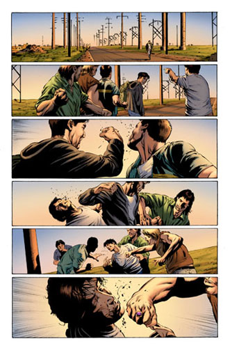
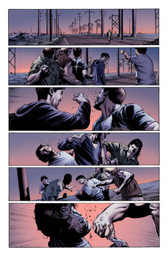
One big change I had to make was the fight scene between Nick Andros and the bullies in issue 2. The script specified “it’s dusk; the shadows are long”. The colors I initially chose, however, were too light and pastel. Mike wanted something more dramatic, so I changed the color scheme to a darker purple and pink twilight. It worked out well in the end.
Once the book is finished and I’ve sent Marvel my high-resolution colored pages, a PDF of the entire book is compiled and sent to Mr. King. I am not aware of any changes that have come about at this stage; it seems that Marvel editorial is quite adept at catching the little things before the proofs get to Mr. King.
Lilja: Is it nervous to work on something as big as a Stephen King book or is that just like any other comic?
Laura Martin: At first it was nerve-wracking. I really wanted to do a bang-up job on the coloring, and honor the original story as best as I could. Also, while I’d colored Mike’s artwork before, I hadn’t done it in a while, so I needed to get comfortable with rendering his work again. Once the first few issues were done, I felt more confident with my color choices and rendering style, and things flowed more easily. Every time I come across a new character, however, I get all excited again. I had a great time coloring Rita Blakemoor; when one has been coloring superheroes for a long time, an aging socialite in designer clothing is a refreshing change of pace. I’m looking forward to Tom Cullen and the Trash Can Man!
Lilja: Given the good reviews the comic has gotten you must be very proud of your involvement in it?
Laura Martin: I am extremely proud of our work as a whole. The collaboration has been very smooth, and clearly Roberto, Mike and I love the tale we’re retelling. But the greatest joy comes from fans who loved the book and are enjoying the graphic retelling. The fans are our greatest critics, and so far, it seems that we’re doing it right by them!
Lilja: Does it make it easier or harder to get good reviews? I guess it must feel nice but I also guess it puts pressure on you to keep delivering the same high quality as well, right?
Laura Martin: Reviews, both good and bad, keep me on my toes. As long readers and reviewers are paying attention, I work hard to keep them happy, or to make them happier if I’d done something wrong. There are certain things that might come up in reviews that I can’t do anything about, such as word balloon placement; that’s not my dominion. But, for whatever I can control, as long as there are readers commenting on it, I’m paying attention.
Lilja: Were you or are you now a fan of Stephen King and his work? Had you read The Stand before this assignment?
Laura Martin: I’ve read dozens of King’s novels and short story collections, mostly the early works, and The Stand was my favorite (although I didn’t read the unabridged version until recently). It’s been a while since I’ve read his work; somewhere along the way, my interests shifted from horror to crime/forensics/police procedurals, so I don’t read much horror anymore. I did read the comic adaptation of the Dark Tower series. I still go back and visit the old novels and short story collections from time to time. Some of the stories in Night Shift still freak me out as much now as they did when I first read them in the mid-1980s. When I got wind of the possibility of this assignment, I immediately read the unabridged version of The Stand, and it’s been next to my desk ever since.
Lilja: How far in the series are you now? I take it that you are in for all the issues, first to last, right?
Laura Martin: The first volume of The Stand was subtitled Captain Trips, and consisted of five issues; the second volume is American Nightmares, and I’m awaiting artwork from Mike for issue #2, which will be our seventh issue total. I’m in it for the entire series; as long as they publish it and keep sending me pages, I’m there!